Choosing the right colors for your patio pavers can be just as important as selecting the materials and design. The color of your pavers will set the tone for your outdoor space and can greatly influence its overall aesthetic and feel. In this blog, we’ll guide you through the process of selecting the best paver colors to complement your home and landscape. Contact Coastal Patio Pavers of St. Auguseint to take the next step and have your patio installed by a premier paver installation company
1. Consider the Style of Your Home
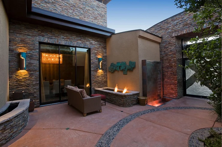
The first step in choosing paver colors is to consider the architectural style of your home. Your patio should blend harmoniously with your house and the surrounding environment.
- Traditional Homes: Earthy tones like red, brown, and beige complement the classic look of traditional homes. Brick pavers in warm hues are ideal for creating a timeless, rustic feel.
- Modern Homes: For a sleek, contemporary look, opt for neutral colors like grey, charcoal, and black. These colors offer a clean, minimalist aesthetic that pairs well with modern architecture.
- Mediterranean or Spanish-Style Homes: Warm, sun-kissed colors such as terracotta, sand, and warm grey work well with Mediterranean or Spanish-style homes. These hues can enhance the vibrant, welcoming feel of your patio.
Pro Tip: If your home has a mixed architectural style, choose paver colors that match or complement the dominant exterior elements, such as the roof or siding.
2. Think About the Surrounding Landscape
Your paver colors should also harmonize with the surrounding landscape. Consider the colors of your garden, trees, and any existing hardscape features.
- Lush Greenery: If your yard is filled with lush greenery, neutral tones like grey and beige can provide a beautiful contrast, allowing the vibrant colors of your plants to stand out.
- Desert or Dry Landscapes: For dry, arid landscapes, warm tones like tan, sand, and brown can blend seamlessly with the natural surroundings, creating a cohesive look.
- Water Features: If you have a pool or water feature, cooler tones like blue-grey or slate can enhance the serene, refreshing atmosphere.
Pro Tip: Bring samples of your chosen paver colors outside and place them near your garden or other landscape features to see how they look in different lighting conditions.
3. Coordinate with Existing Hardscape Elements
Take into account any existing hardscape features, such as driveways, walkways, or retaining walls. Your paver colors should either match or complement these elements to create a cohesive look throughout your property.
- Matching Tones: For a unified appearance, choose paver colors that match the existing hardscape elements. For example, if your driveway is made of red brick, consider red or brown tones for your patio pavers.
- Complementary Colors: If you prefer some contrast, choose complementary colors that enhance the overall design. For example, if you have a grey concrete driveway, tan or beige pavers can add warmth and depth.
Pro Tip: Use a color wheel to find complementary colors that work well together. This can help you create a balanced and visually appealing design.
4. Consider the Function of the Space
The function of your patio can also influence your color choices. Different activities and uses might benefit from different tones and shades.
- Dining Areas: For patio areas designated for dining, darker paver colors like charcoal or slate can help mask spills and stains.
- Lounge Areas: For lounging or relaxation spaces, softer, lighter colors like beige or light grey can create a calm and inviting atmosphere.
- High-Traffic Areas: In areas with heavy foot traffic, darker colors are generally more forgiving when it comes to dirt and wear.
Pro Tip: Use a combination of colors to designate different zones. For example, use a darker border around a lighter main area to define the space and add visual interest.
5. Test the Colors in Different Lighting
Outdoor lighting can drastically change the appearance of your paver colors. What looks great in a showroom or under indoor lighting may look completely different in natural sunlight.
- Daylight: View your paver samples in direct sunlight to see their true colors. Keep in mind that darker colors may absorb more heat and become warmer under the sun.
- Evening Light: Check how the colors look under your outdoor lighting at dusk or in the evening. Some colors may look more vibrant or muted depending on the type of lighting.
Pro Tip: Leave your paver samples outside for a few days to observe how they look under different weather conditions and at various times of the day.
6. Use Color Blends for a Natural Look
If you’re unsure about committing to a single color, consider using a blend of colors. Blended pavers can mimic the natural variation found in stone, providing a more organic and less uniform appearance.
- Natural Stone Look: Choose pavers with blended colors that resemble natural stone for a rustic, earthy feel.
- Subtle Variations: For a softer look, opt for pavers with subtle color variations within the same color family. This adds depth and texture without overwhelming the space.
Pro Tip: Mix pavers from different pallets during installation to ensure an even distribution of color and prevent patches of the same shade.
Conclusion
Choosing the right paver colors for your patio is a crucial step in creating a cohesive and visually appealing outdoor space. By considering the style of your home, the surrounding landscape, and the intended function of the space, you can select colors that enhance the beauty and value of your property.
Need help choosing the perfect paver colors for your patio? Contact Coastal Patio Pavers today for expert advice and a free consultation. Our team can guide you through the process and help you create a stunning patio that reflects your personal style.